
Monday, December 9, 2013


Monday, April 29, 2013
Pufferbelly Station Remodel
This Semester we were assigned to remodel the Pufferbelly Station here in Pullman Washington to become a gallery, studio, and residential space. We were to find a Northwest artist and design our space for them. I designed for Fields and Fields who does glass blowing in portland. We also had to find our inspiration from the Pufferbelly station and I found this broken down wall that showed layers of lass, brick, and plaster. And from my inspiration I came up with my concept of layers, texture, and organic lines. From my inspiration and artist I came up with the title Naturally Occurring because the art work from my artist is inspired by nature and the idea of the wall slowly breaking down over time naturally occurred.
The textile design was pretty enjoyable for me because it was something different then we usually do. It was challenging to pick out your final parti to put into your design and to figure out the pattern you wanted. But it was rewarding to get your design on the computer and printed. It was exciting for me to do this because it was another part of design that we got to work with that I never had the chance with before and to now have the resources to do that again is excited. Designing the textile was a new experience that I enjoyed very much.
Another component of for the project that was enjoyable was the bench design. What I loved about the bench design was that I was able to find components from my inspiration and my parti that I liked and put them in my bench design. I was able to see a lot out of my bench design so it was exciting to be able to continue it in my design of the Pufferbelly station. I also learned a lot about welding in my design because of all the research i had to do for the construction of it.
Space planing was a difficult task for me on this project because the artist I picked did glass blowing and an ideal glass blowing studio is in need of about 2,000 sq. feet. The square footage of the pufferbelly station is about 4,000 feet and with the space given I was having a difficult time of using the space. Another challenge with the space planning was to fit the residential space that was ADA accessible with 36" door ways, 4 foot wide halls, and 60" wheel chair turning radius in all rooms. So figuring out the space planning was difficult but I am pleased with how my design turned out.
This was my first time ever design a gallery space and I found that to be difficult because I didn't want it to be simple and white like more gallery spaces you see. So to make it a different space I brought in my concept. I use the materials and the designs of my bench design and turned it into shelving and display units. being able to use my concept in my gallery space made the space have so much more personality and I felt like it really worked with the art work of Fields and Fields. One thing have could have worked on better on the space and the flow of walking through the space.
One of the most challenging aspect of this project for me was 3-D modeling. I haven't yet figured out how to model yet. It was difficult to do the roof as the skill to model a rood is different from putting up walls. I think it would be beneficial someday to take a class in 3-D modeling. I'm happy though that my model actually came together/.
I am pleased with my final product it was a great project that challenged me in so many ways. It was a project that worked with both commercial and residential spaces and making them work with each other. I believed it to be a great project that taught us many things and was challenging at the same time. I enjoyed this project vary much. :)
I am pleased with my final product it was a great project that challenged me in so many ways. It was a project that worked with both commercial and residential spaces and making them work with each other. I believed it to be a great project that taught us many things and was challenging at the same time. I enjoyed this project vary much. :)
 |
| Process Board- With Fabric detail/ inspiration/ concept statement/ and site plan |
 |
| Exterior elevation/ and section focusing on ceiling hight |
 |
| Floor plan with furniture |
 |
| Egress and ADA access floor plan |
 |
| Gallery View and gallery materials |
 |
| Kitchen and kitchen materials |
 |
| Office/ studio/ and living room views and materials |
Wednesday, March 20, 2013
Hotel Lobby Sketch

Textile Design
 |
| Parts of the text-tile Process Design |
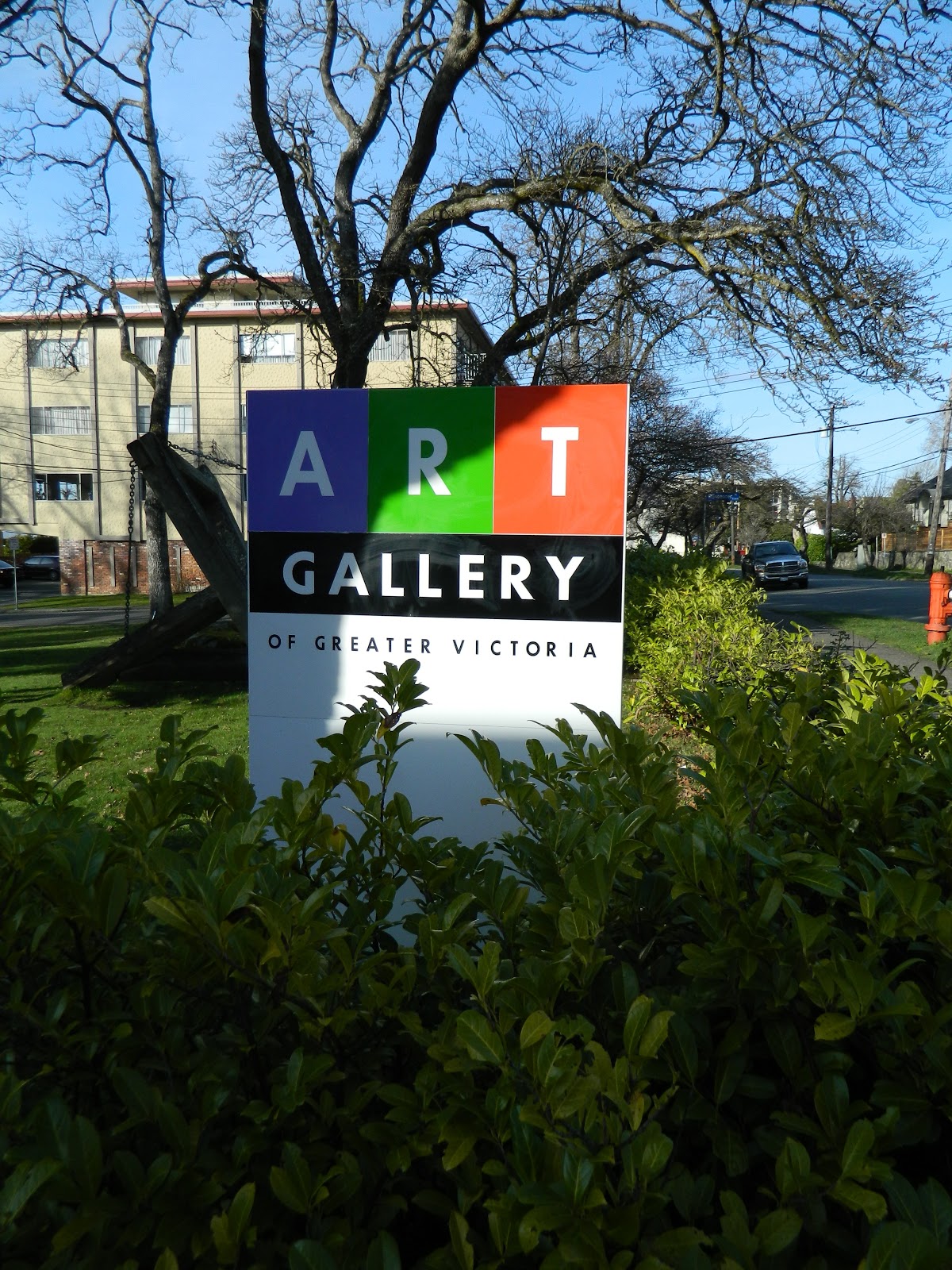
Art Gallery Experience
 |
| Entrance to the Emily Carr Exhibit |
 |
| Inside the Exhibit |
The Emily Carr exhibit is in the Greater Victoria Art Museum down town Victoria B.C. Canada. Emily Carr is a painter that uses oils and acrylics. She studied art in France and came to Canada to use the landscapes as her inspiration. The exhibit is a smaller exhibit it is about 40 by 45 feet and approximately 1,800 square feet. The wall were moveable and it was minimal light on the art. The walls were colored block and it represented her art well but it was slightly distracting because her art also used a lot of color. The ceilings were wood planks and the floors were cement with a glossy finish. It was a simple layout which was easy to fallow and made it so you wouldn't miss any work. Color blocking the walls was a way for you to fallow it. There was lots of open space between the pieces so multiple people could look at the same piece at the same time. There is also a bench in the center of the exhibit so people can look at the work and take a rest. One thing that I thought was nice for the exhibit was the story of the artist was the first thing you saw once you walked into the exhibit. It was a smaller exhibit that was easy to fallow and represented Emily Carr well.
Thursday, March 14, 2013
Impaired Vision Experience
 |
| Using an ATM machine and feeling it to find the numbers |
 |
| One experiment was to read an article through a plastic bag |
 |
| We had to wear glasses with rubbing cream on them. This is a photo with the glasses on and the glasses off. |
Friday, December 7, 2012
One Bedroom and Common Space Assignment


 |
| over all of the apartment |
 |
| living room |
 |
| kitchen |
 |
| bedroom |
 |
| bathroom |
Habitat for Humanity

Client Brief

 This semester we met up with our client Seth owner of the st. Elmo's hotel in Palouse WA. His goal is to renovate the hotel into apartments and spa. His goal was to keep the original building as much as possible and keep the building as eco-friendly as possible. There were several complications with the building but there came to be solutions with every problem through out the project. One material that Seth could not go without was glass blocks. At first I thought it would be complicated to get that into a mondern comtempuary deign but as always we figure out away. In our client brief its is noticable that there were complications and goals that every client has, and as an Interior Designer it is your job to solve it.
Wednesday, November 28, 2012
Project Feedback
Over this past Thanksgiving Break I had the opportunity to get positive and critical feedback on my current one-bedroom apartment project. I met up with Interior Designer Sarah McGroven from Milieu Design downtown Spokane Washington. McGroven gave me several tips on my floor plan and helped me strengthen my creativity on how to bring in more natural light into a space that doesn't have much flexibility. She also gave me more ideas on how to show off my concept in my design of the one-bedroom apartment. It was an educational experience to learn from her in our meeting but it was also a valuable experience to see the day and the life of an Interior Designer. McGroven took me to her studio and a few of her co-workers studios and I had the opportunity to look at some of her current projects. It was so nice to get advice from a professional Interior Designer. This opportunity also made me realize that there is no right or wrong answer to Design it just on how you see it and creating something that you think will please others. Sarah McGroven helped me so much in my project, I'm excited to see the out come. :)
Monday, October 22, 2012
St. Elmos Bathroom Design
 For the Past two weeks we have been working on a bathroom design for the St. Elmo's 2 bedroom apartments. For this design I stuck with my concept model of diagonal lines, layers, and natural hues. I also brought in a little inspiration from the paint "The Birth of Venus" with it's sweet natural color hues. I found some parts of this project difficult because it was focusing on ADA design and making it wheel chair accessible. To make it wheel chair accessible there is front and side access to the toleit, five foot turn around, large shower, grab-bars, three foot door entry, and front access to the sink. I found it challenging to find the right tiles but i enjoyed it. I wanted to go for the natural stones and not have it feel so cold. I picked an Italian mosaic tile that captures the light. I also brought in a artistic pendent light that i enjoy that resembles the "Birth of Venus" well I believe. I am pleased with the outcome of my design and ideas.
 Monday, October 8, 2012
Sketch Crawl With The Urban Sketchers
We went to the Seattle Sculpture Park and had a great time sketching. It was a beautiful day to just get out and draw what was in front of us. I have never gone out with a large group before to just do some sketching and share our work after, for it being my first time I really enjoyed it. One of the things that made this experience even better was that the Urban Sketchers joined us and they are a group of extreme talent, they shared their work with us and one lady gave me some useful pointers. A pointer that I will take from is this that to bring your eye to only one area and just make that part shine that other area of it is just the frame. After looking at her work I feel like that is advice to take. It was a great time and I just simply enjoyed it. :)
 |
| With Pastels |
 |
| Flare and Color Pencils |
Habitat For Humanity Home of the Future
Habitat for Humanity was having a display in Seattle by the Space Needle of the home of the Future. It was mainly focused on susantable materials and energy saving. Ways they came up for energy saving was the wetbox. They had all their appliances all connected to each other, this includes sinks, dish washer, washer, toilets, and water heater. This way there would be only one water line. It doesn't just save on cost but it make the building process a lot faster. They also did double wall insulation and double windows to keep the heat in the home. Another idea was that they used large windows to the home seem larger and to bring in more natural light. I thought that the home layout was interesting and it was a great opportunity to learn about the habitat for humanity organization.
 |
| Quick Sketch of the Home |
Job Shadowing With Starbucks
This was a great day I had the opportunity to spend the day at the Starbucks Headquarters and learn about their design and concept. We toured the headquarter and had the chance to admire the beautiful building. We had the opportunity to meet several people and learn about their position and the work that they provide for Starbucks. I learned that Starbucks has three base design concepts, Heritage, French Industrial, and Artisan. A lot the the employees there gave us a lot of pointer for an interior design life style. A lot of the Things that were shown to us where top secret so unfortunately i wouldn't be able to share them with you. But overall experience was wonderful and I hope someday to work for them, I feel like its a different rout for design that is so appealing to me. One main thing I gathered from them was practice practice practice and time management.


Kitchen Design
 |
| Over all Presentation of Kitchen Design |
 |
| Materials used |
 |
| Perceptive Sketches |
 |
| Model of Design |
Ride Don't Walk
 |
| Me at the counter, with starbucks <3 |
 |
| My view to a counter |
 |
| My sketches From the Wheel chair perspective |
 |
| Me at the sink |
 |
| My view at the sink |
Concept Models from Inspired Song Lyrics
My inspiring song for my concept models was the House That Built Me by Miranda Lambert. from this song were the words memories, to go, and tree. The word memories resembles layers to me they can be the same size and different sizes. The phrase "to go" paints a directional line so lots of vertical lines. The word tree gave me the idea that organic feels had to be involved, so texture, shape and color. For my models that what I focused on layers, diagonal line, and organic feels. After modeling my three concept models I decided that I wanted my final model to feel more open and have a view point from all angels. So my final model represents layers, diagonal lines, and multiple viewpoints.
 |
| Concept Models |
 |
| Final Concept Model |
Subscribe to:
Posts (Atom)